Turning a free app icon template into a design resource for professionals
Starting from a blank slate can be daunting. You don’t know where to go next because you lack context and guidance. Regardless of the area of expertise, blank slates can block creativity and productivity. I believe that for the most part, working on top of some predefined constraints and contextual cues will yield better results, faster.
The philosophy of Apply Pixels is to be a design resource that takes the daunt out of starting a new project, by enabling designers and developers to jump over technical obstacles and avoiding blank slates.
Since 2014 I’ve been part of this independent and bootstrapped project, together with designer Michael Flarup and developer Kristian Andersen.
In August 2018 we began a redesign of Apply Pixels, which launched in march 2019. The goal was to build a sustainable platform for industry-standard design resources.
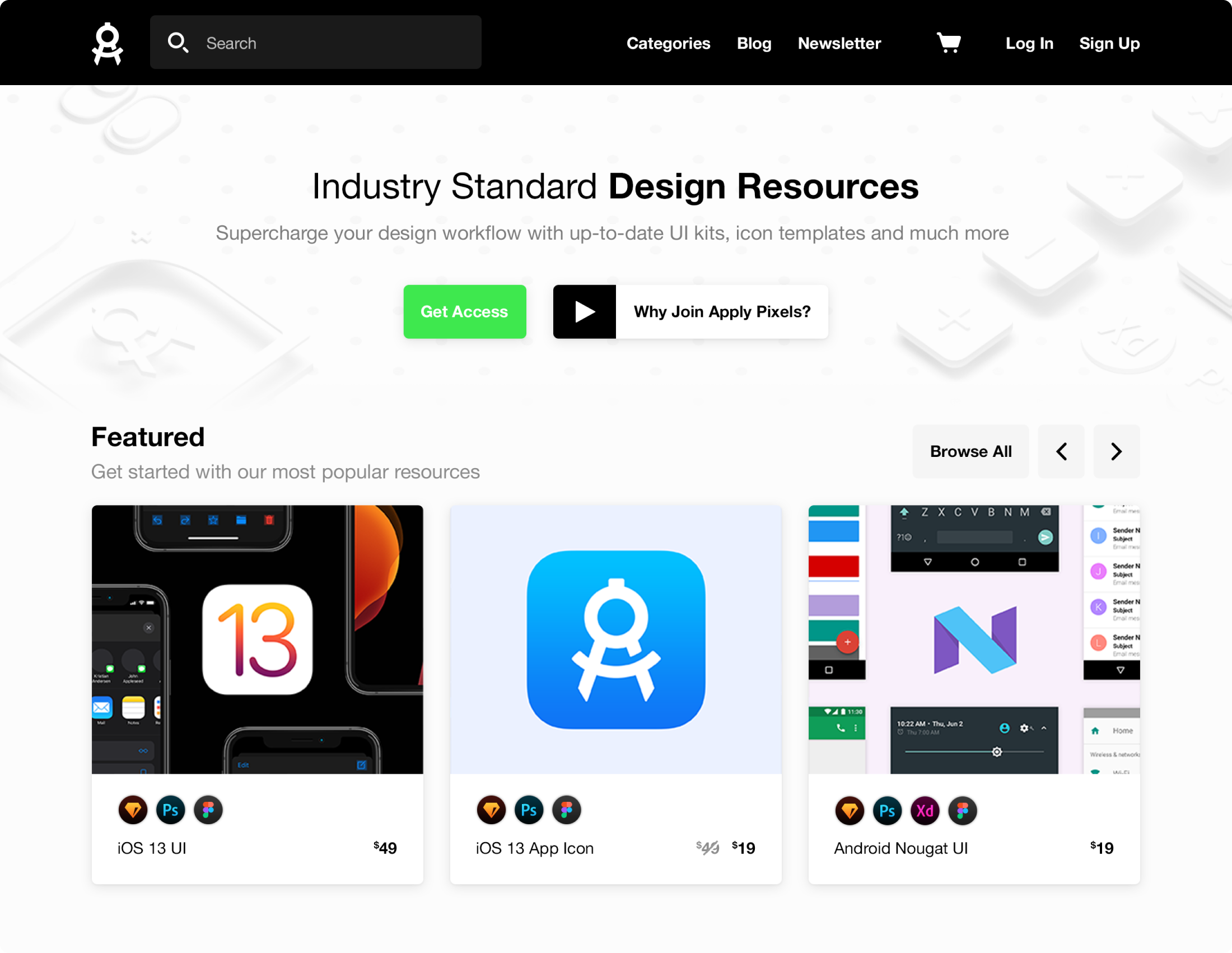
The redesigned and rebuilt Apply Pixels, which we launched in March 2019.
Why we redesigned Apply Pixels
To put it briefly: the collection of tools and templates had outgrown the capacity of the site.
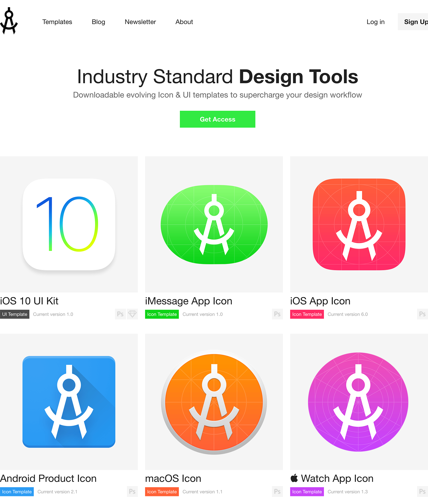
The old site, which was designed in November 2015, had done it’s job well. With only six resources available at the time, members could go to the site to find and download the template they needed very easily. The site did not have search, categories, featured sections or any other way of navigating, but it worked well with just six templates. Fast forward to the summer of 2018 and there were now more than 50 different templates available on Apply Pixels.
Therefore the redesign we began in August 2019 would not just be a fresh coat of paint. In order for Apply Pixels be a one-stop shop and the go-to place for starting new projects, we needed to redefine some things.
Going away from subscription-only
Having worked on appicontemplate.com and Apply Pixels for many years, we knew a lot about the customer base. They are developers and designers, typically indie, but they have in common that they keep coming back to Apply Pixels because of the large amount of time it saves them.
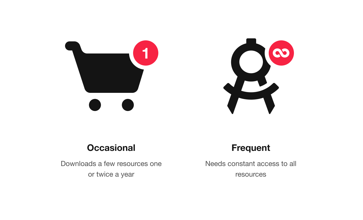
In particular, two types of customers informed the redesign.
The occasional downloader: Typically someone who just needs to download a resource once or twice a year, when new mobile devices and operating systems are released and the design resources are updated.
The frequent downloader: Typically someone who works on a lot of different projects all the time – for example in a digital agency. This customer segment often needs to start off a new project by going to Apply Pixels to download a ‘clean slate’.
The current site already provided frequent downloaders with unlimited downloads through a membership, but there was no way for the occasional downloaders to grab just a single resource without having to purchase a monthly or yearly membership.
Tackling the growing resource library
At the time we redesigned Apply Pixels, we had more than 50 different design resources being offered on the platform. This posed some challenges in the current interface. Originally the resources on Apply Pixels were focused on icon templates for creating iOS, Android or macOS icons. Now there were also UI kits, screenshot templates, wireframe kits, 3D presentation templates and icon packs.
We narrowed down some goals for the redesign.
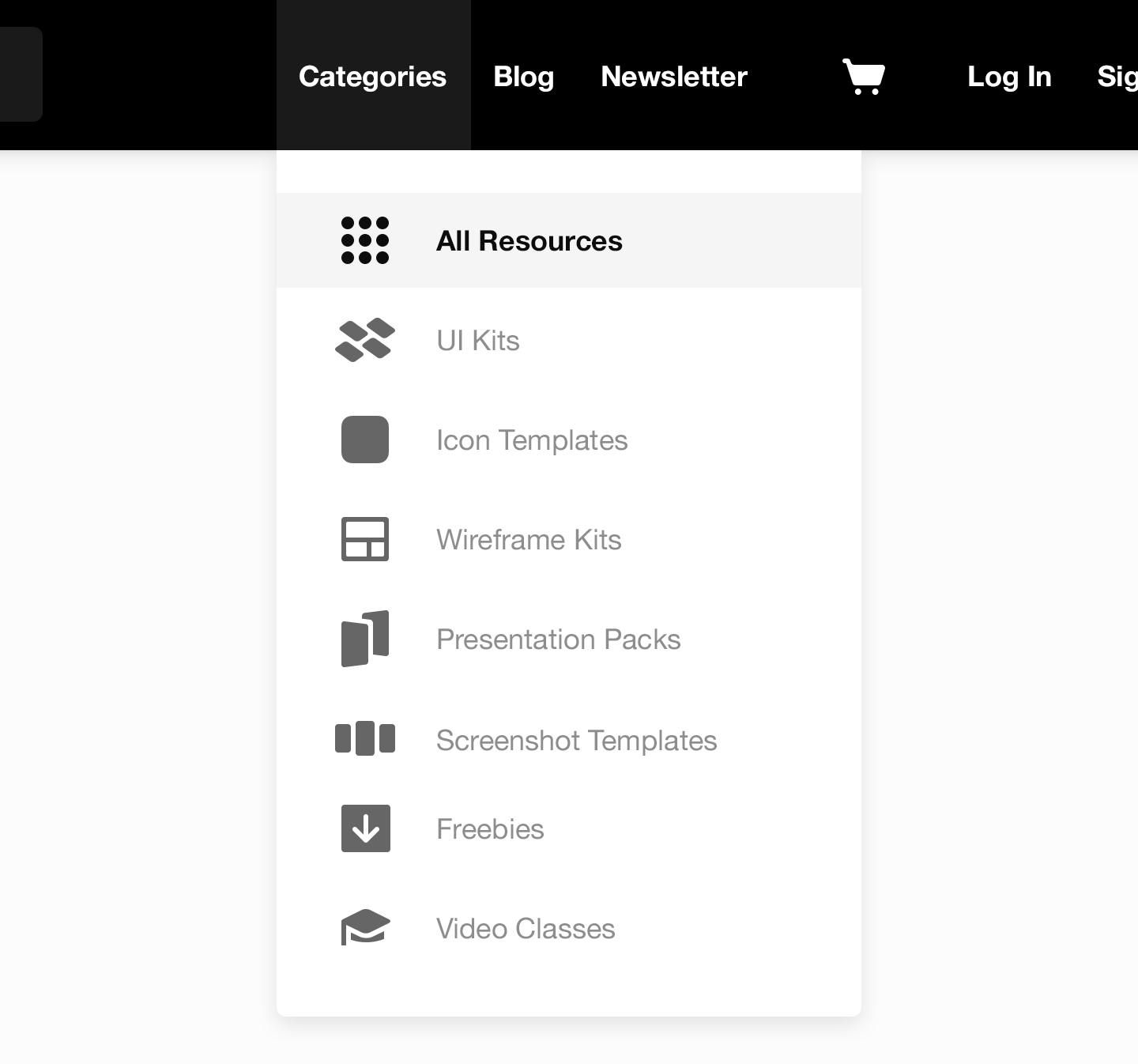
Better overview and navigation: We had to improve the navigation and overview so customers more easily could navigate to and download the right resource.
Supporting multiple resource types: This included anything from icon templates to UI Kits to video classes.
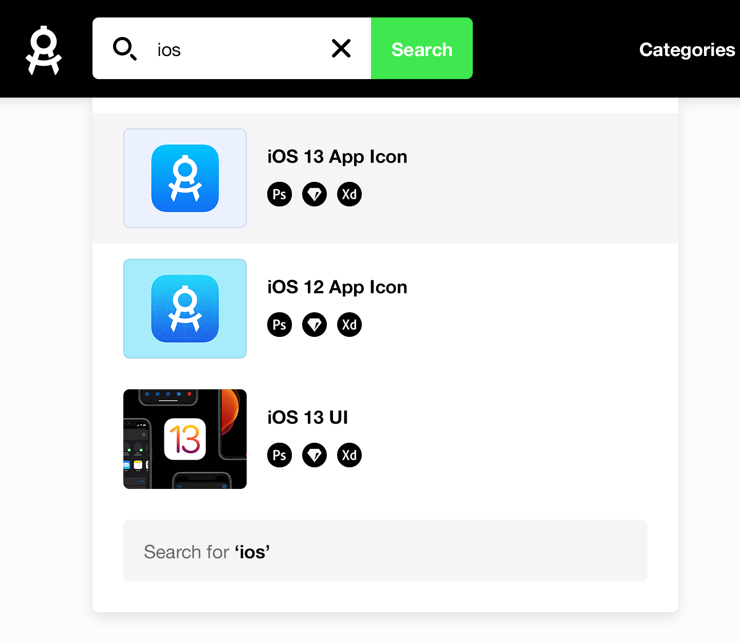
Searchable resources: The site had to provide fast search in order for frequent downloaders to quickly get started with new projects.
We introduced seven resource categories to handle the growing variety and amount of resources. This improved the overview and navigation of the site.
We boiled down the presentation of resources to two separate layouts: One layout for regular design resources such as icon templates and UI kits, and another layout for video classes.
The download page for a regular resource.
The download page for a video resource.
The redesign was a good opportunity to add search functionality – a highly requested feature that the original site did not include – and which could have been hard to implement with the previous tech stack.
Reflecting on the sufficiency of redesign
In my view Apply Pixels is a classic example of something that gets shaped by its content and context over time.
At the time the original Apply Pixels platform was designed in 2015, it would have been overkill to build a fully-fledged platform for the few templates that were available then. But it’s important to recognize when a product is no longer fit for their purpose. No matter how well designed something is, it must constantly be evaluated and potentially redesigned. So although the original platform was perfectly fit for its purpose, the content outgrew its surroundings and resulted in this complete redesign and rebuild.
Both Kristian, Michael and I were very proud when we launched this redesigned Apply Pixels in 2019, but we also knew that it might not be the last redesign of Apply Pixels. For the time being it is sufficient – and it was the best we could deliver in a team of three.